
Branding
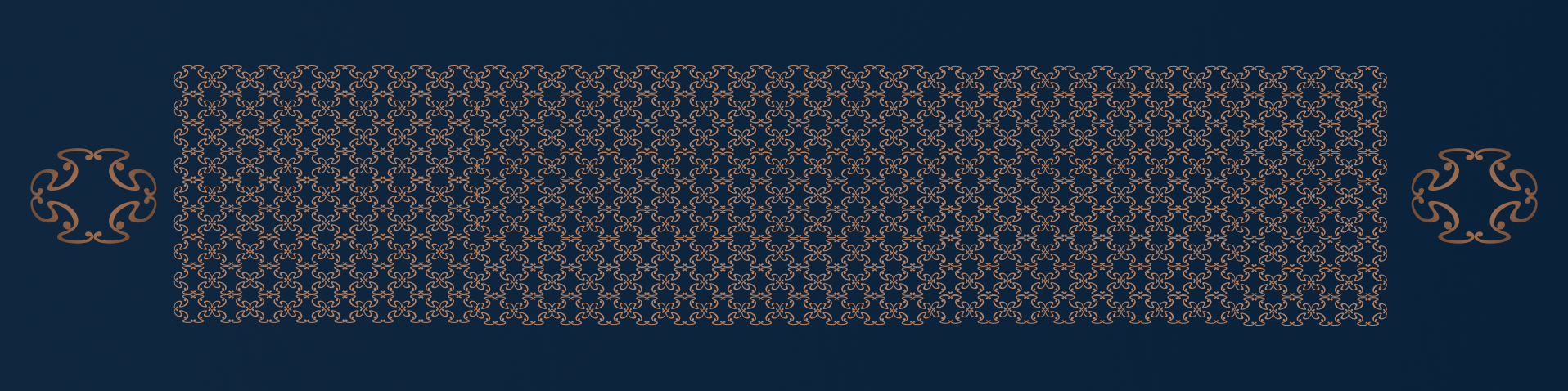
WAND built this brand identity from scratch: the logo and the design principle that ties the two together everywhere the brand appears.
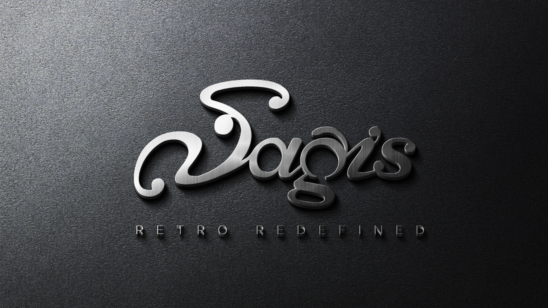
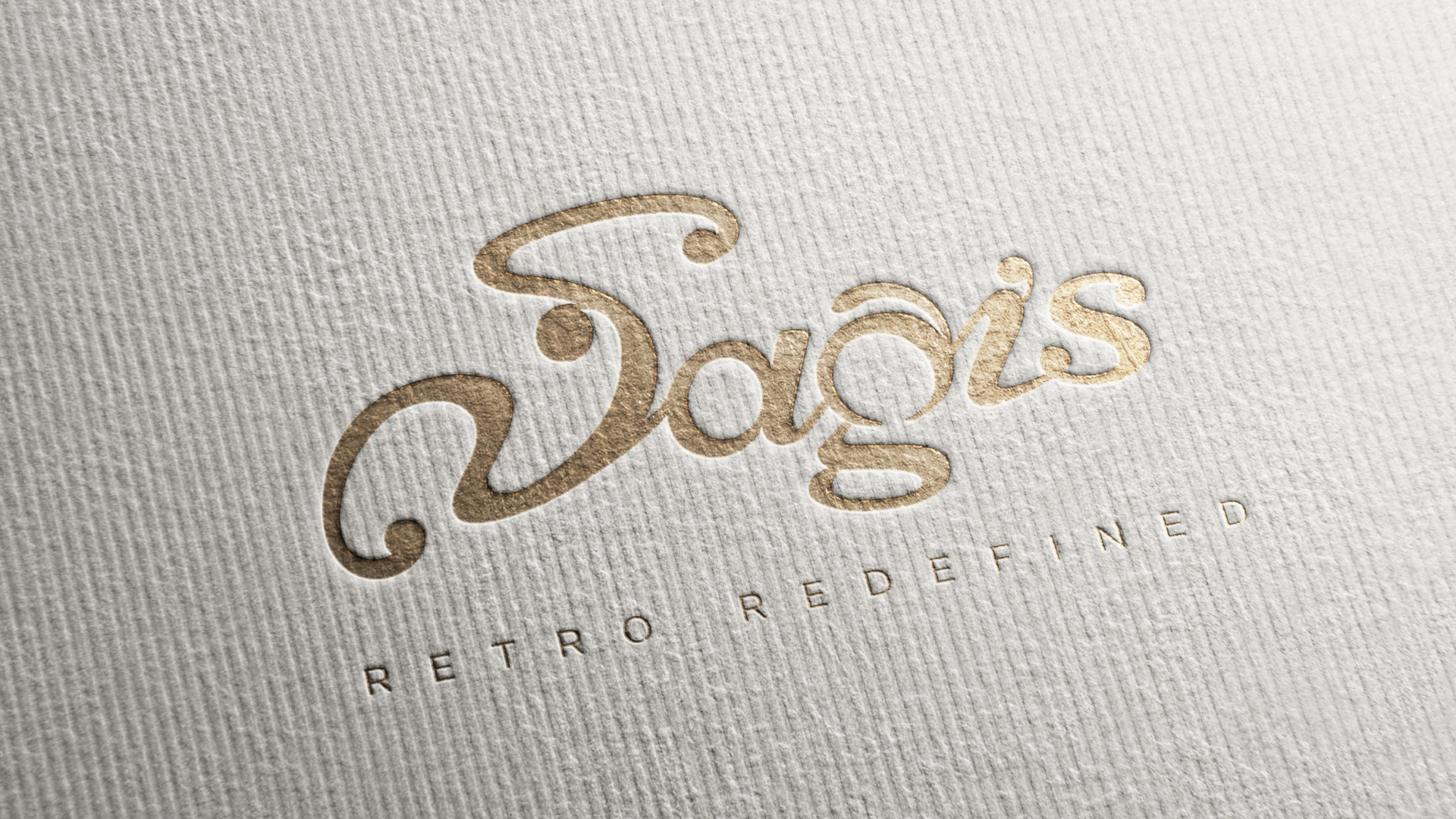
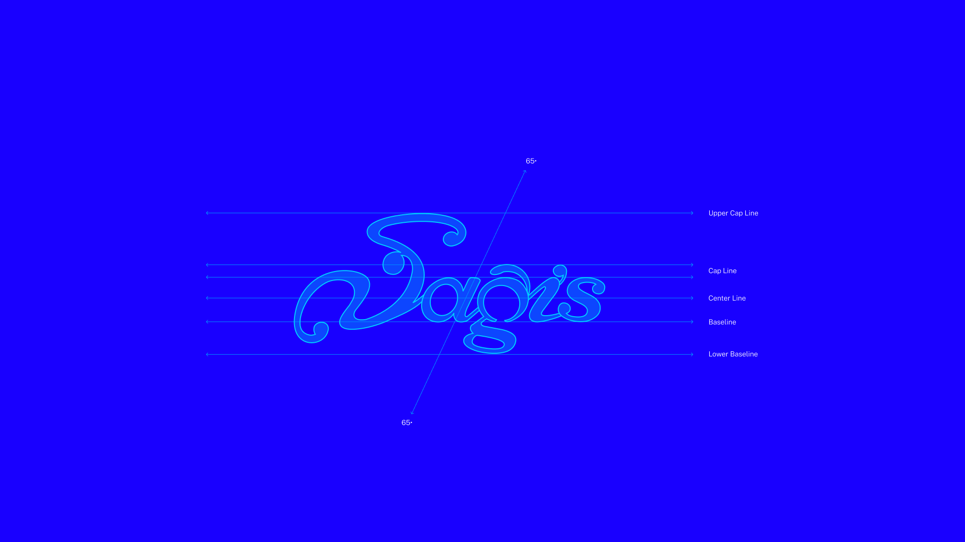
The logo comes from the Kannada letter “ಸ” (Sa), drawn so it also reads as the English “Sa.” Kannada and English readers each see their own letter. One logo and one voice, used consistently, so the brand looks the same on a sign, a page or a screen.